
Mixing wallpaper and paint can feel intimidating. Get it wrong, and it can feel disjointed, busy, or overwhelming. But when you get it right, you can have a home that looks straight out of a magazine.
At Southern Highlands Painting and Wallpapering, we’ve helped countless homeowners transform their spaces using just the right balance of feature wall wallpaper, interior house paint, and clever design tricks. We know exactly where people stumble and how easy it is to avoid the common mistakes.
In this guide, you’ll discover simple, practical tips to confidently combine wallpaper and paint, create stunning feature walls, and pull off that “designer look” without stress.
The Golden Rule: Balance is Key
When it comes to mixing wallpaper and paint, the biggest mistake people make is going too heavy on both. Too many bold patterns and strong paint colours can clash and overwhelm a room, leaving it feeling chaotic instead of cohesive.
The secret? Balance.
Think of it like dressing up. If you wear a loud patterned shirt, you pair it with simple trousers to let the shirt shine. Your walls work the same way. If you choose a striking feature wall wallpaper, you want the surrounding walls painted in a calm, complementary shade. This lets the wallpaper become the star of the show without everything competing for attention.
A good rule of thumb:
- One bold element (either your wallpaper or your paint)
- Three supporting elements (neutral or softer tones)
By keeping this balance in mind, you create a space that feels polished, inviting, and thoughtfully designed — not like a patchwork of ideas thrown together.
Choosing the Right Feature Wall Wallpaper
Your wallpaper sets the tone for the entire room, so picking the right one is crucial. But with so many gorgeous options, it’s easy to feel overwhelmed.
First, think about the mood you want the room to have.
- Want something calming? Look for wallpapers with soft textures, subtle patterns, or muted colours.
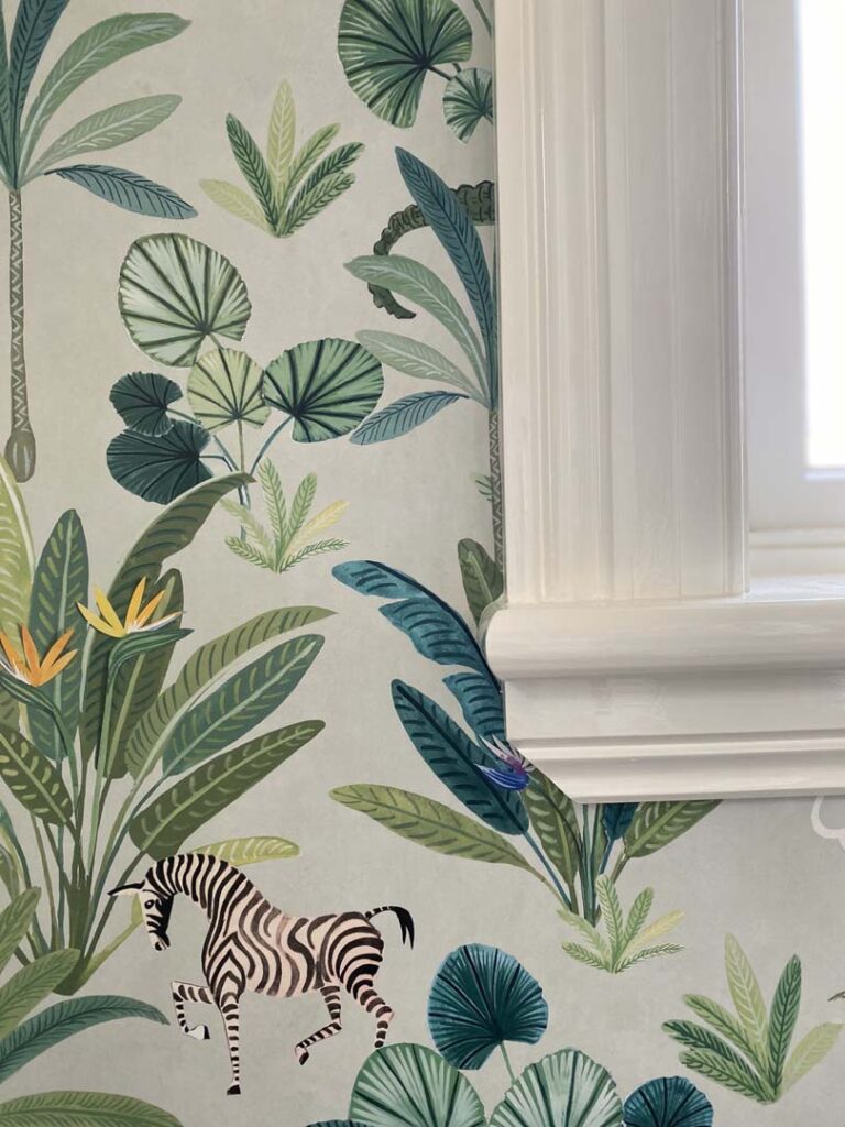
- Craving energy and drama? Bold prints, metallic accents, or rich colours can bring that wow factor.
When choosing feature wall wallpaper, also consider the size of the pattern.
- Large patterns work best in bigger rooms where they have space to breathe.
- Small, intricate designs are better for cosy spaces where a big print might feel overpowering.
And remember: your wallpaper doesn’t have to match your furniture exactly. Instead, it should complement it. Look for colours or themes that connect naturally with your existing pieces. This creates a sense of flow rather than a forced or “over-styled” look.
Finally, don’t be afraid to trust your gut. If a wallpaper makes you smile or feel inspired the moment you see it, it’s probably the right one for your space.
Selecting Complementary Interior House Paint Colours
Once you’ve chosen your feature wall wallpaper, it’s time to pick the perfect interior house paint to tie everything together.
The key here is support, not competition. Your painted walls should enhance your wallpaper, not fight for attention.
Here’s a simple way to choose:
- Pick a background colour from your wallpaper and use a similar shade for your painted walls.
- Alternatively, go for a neutral tone (like soft greys, warm whites, or gentle taupes) that blends effortlessly with your wallpaper’s palette.
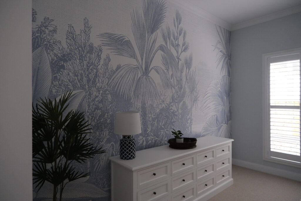
For example, if your wallpaper has a botanical design with shades of green and cream, a soft cream or muted sage green on the surrounding walls will create a serene, cohesive feel.
Top Tip:
Always test paint samples next to your wallpaper swatch at home. Lighting can change how colours look dramatically, and what seems perfect in a shop can feel completely different in your space.
Choosing the right paint colour will make your wallpaper decor pop beautifully, giving your room that designer touch you’re aiming for.
Placement Matters: Where to Wallpaper and Where to Paint
Even the most beautiful wallpaper decor won’t look right if it’s not placed thoughtfully. Knowing where to use wallpaper and where to stick with interior house paint, is key to creating that seamless, designer finish.
Where to wallpaper:
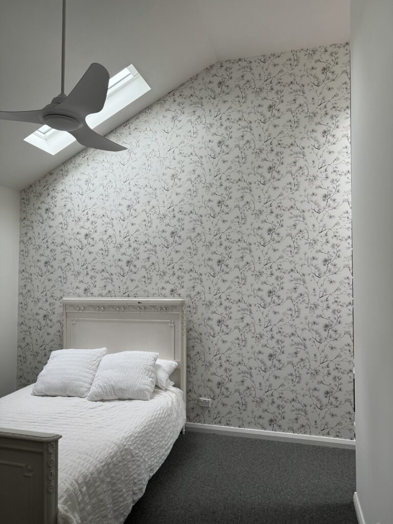
- Feature walls are the classic choice — the wall behind a bed, a fireplace, or a sofa instantly draws the eye.
- Entryways and hallways can also be stunning spots for wallpaper, setting the tone as soon as someone steps inside.
- Dining rooms or studies can handle a little more drama with wallpaper on all four walls if you choose a subtle pattern.
Where to paint:
- Walls with windows or doors often make better painted surfaces — wallpaper can get broken up too much, making it lose impact.
- Walls opposite a feature wall should usually be painted in a complementary colour to avoid overwhelming the space.
Quick tip:
If your wallpaper is bold and colourful, keeping the surrounding paint neutral allows the room to breathe.
If the wallpaper is soft and subtle, you can afford a bit more richness in your paint choice.
By being intentional about placement, you give each design element room to shine, instead of fighting for attention.
Common Mistakes to Avoid When Mixing Wallpaper and Paint
Even with the best intentions, it’s easy to fall into a few traps when mixing wallpaper and paint. Here’s what to watch out for:
1. Going Too Bold Everywhere
It’s tempting to pick a vibrant wallpaper and a rich paint colour, but this can make the room feel busy and overwhelming. Let one element be the star, and keep the other more subdued.
2. Ignoring the Lighting
Colours and patterns can look completely different depending on the light in your home. Always test wallpaper samples and paint swatches in the room itself before making final decisions.
3. Forgetting About Flow
Rooms should feel connected. If you use feature wall wallpaper in one room, think about how it will transition into the next space. Keeping a consistent colour palette across rooms helps your whole home feel more harmonious.
4. Skipping Professional Installation
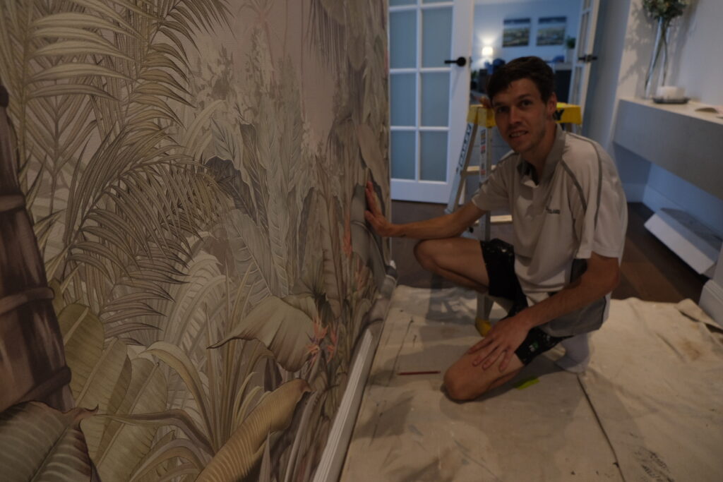
Wallpaper can be tricky to hang, especially if it has a complex pattern or needs to line up perfectly. A crooked or bubbled wallpaper job can ruin even the most beautiful design. Sometimes, calling in a professional is the best investment.
Avoiding these common mistakes will make your mix of wallpaper decor and interior house paint look effortless — just like the homes you admire in design magazines.
Achieving That Designer Look Made Simple
Mixing wallpaper and paint isn’t about following rigid rules. It’s about creating a home that feels stylish, balanced, and unmistakably yours.
By focusing on balance, choosing the right feature wall wallpaper, selecting complementary interior house paint, and placing each element thoughtfully, you can transform any room into a designer-worthy space. Avoid the common pitfalls, and don’t be afraid to call in the experts if you want that flawless finish.
At Southern Highlands Painting and Wallpapering, we’re passionate about helping homeowners bring their dream spaces to life. Whether you’re tackling a single room or planning a full home refresh, we’re here to make it easy, beautiful, and stress-free.
Ready to start your transformation?
Get in touch today and let’s make your walls something to be proud of.