
Why Picking the Right White Paint Can Drive You Mad
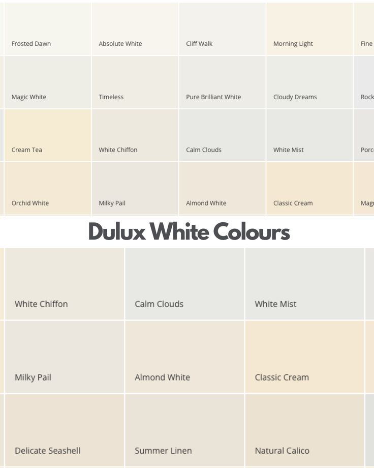
The moment you start comparing swatches — Antique White, Vivid White, Natural White, Snowy Mountain, Whisper White (and that’s just from one brand) — it all becomes a blur. One looks too yellow. Another feels cold. The sample you loved in-store now looks completely different on your wall.
If you’re overwhelmed and second-guessing every sample, you’re not alone.
At Southern Highlands Painting & Wallpapering, we help homeowners through this exact situation all the time. Choosing the right white isn’t just about picking the prettiest name — it’s about understanding your space, your lighting, and what you want the room to feel like.
In this blog, you’ll learn how to tell warm whites from cool whites, how lighting changes everything, which whites actually work in real Aussie homes — and how to avoid the classic mistakes that can leave your walls looking flat, cold, or worse… beige when you didn’t ask for beige.
Table of Contents
Why Choosing White Paint Is Harder Than It Looks
On paper, white seems simple. But walk into any paint store and you’ll quickly realise there are hundreds of “whites” — each with a slightly different undertone, name, and finish.
Here’s why it’s so tricky:
- White isn’t just white.
Most whites are mixed with subtle undertones — like yellow, blue, pink, grey, or green. These aren’t always obvious until the paint goes on the wall and reacts with your lighting, flooring, and furnishings. - It reflects everything around it.
Unlike deeper colours, white picks up and bounces light — and colour — from surrounding surfaces. A warm timber floor can make a white wall look cream. A blue-toned carpet can push it toward grey. - It changes with light.
A white that feels crisp and bright in natural sunlight can look dull, shadowy, or even slightly purple under artificial lighting.
Many homeowners expect white to be the safe choice — but without understanding how it behaves, it can end up being the most difficult decision of all.
Warm vs Cool Whites: What’s the Difference?
Understanding the difference between warm and cool whites is the first real step to narrowing your choices.
Warm whites
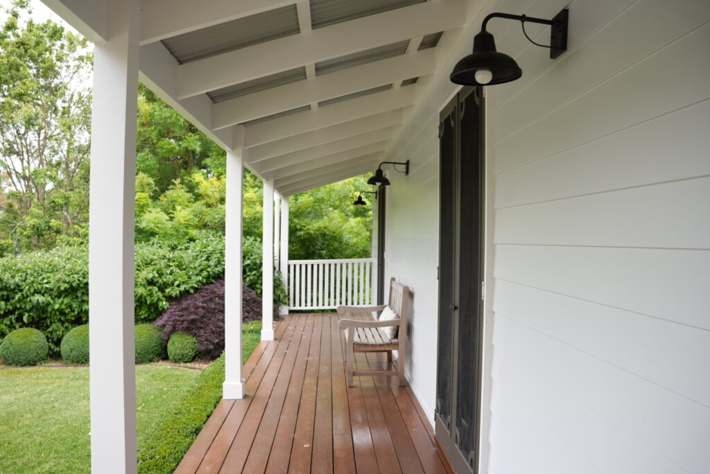
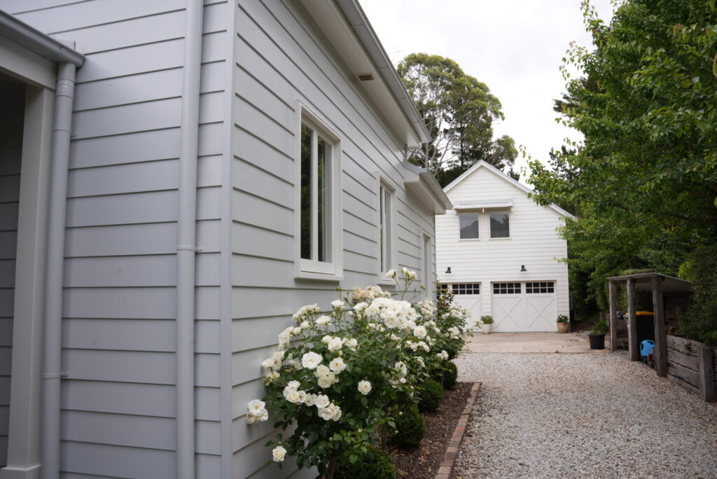
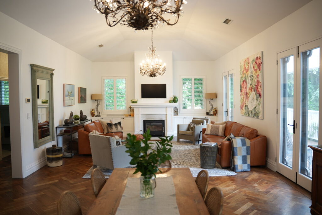
These whites have undertones of yellow, beige or red. They tend to feel soft, creamy and welcoming — ideal for cosy spaces or heritage-style homes. Warm whites work particularly well with timber floors, warmer lighting, and earthy or traditional decor.
Common warm whites:
- Dulux Antique White U.S.A.
- Haymes Magnolia Moon
- Taubmans Cotton Ball
Cool whites
Cool whites lean blue, grey or even green. They feel clean and crisp — often suited to modern, minimalist or coastal-style homes. They pair well with cool-toned finishes like polished concrete, marble or black fixtures.
Common cool whites:
- Dulux Lexicon Quarter
- Haymes Greyology 1
- British Paints White Pointer
Neutral or balanced whites
Some whites sit somewhere in the middle — not too warm, not too cool. These are often the most versatile and forgiving in homes where light and materials vary from room to room.
Common balanced whites:
- Dulux Natural White
- Haymes Minimalist 1
- Porter’s Paints Snow White
How to choose between them?
Ask yourself:
- Do I want the room to feel cosy and soft, or bright and clean?
- Is my flooring warm (timber) or cool (tiles or concrete)?
- Will the lighting be warm or cool?
Getting this part right will make every other decision easier.
How Lighting Affects White Paint (And Why It Can Turn Cream or Grey)
If white paint ever looked “wrong” once it hit the wall, lighting was probably the reason.
White is highly reflective, which means it doesn’t just show its own colour — it also reflects the light and tones around it. That’s why the same white paint can look crisp in one room and murky in another.
Natural light changes everything
- North-facing rooms (in Australia) get cooler light throughout the day. This can make white walls look greyer or even slightly blue.
- South-facing rooms tend to get warm, consistent light, making whites appear brighter and truer to their swatch.
- East-facing rooms have warm morning light but cool off in the afternoon.
- West-facing rooms get warm, golden light in the late afternoon that can bring out yellow undertones.
Artificial lighting matters too
- Warm light bulbs (2700–3000K) bring out creamy or yellow tones in white paint. This works well with warm whites, but can make cool whites feel dingy or mismatched.
- Cool white or daylight bulbs (5000K–6500K) can neutralise warm whites, sometimes making them feel stark or overly blue.
The result?
That “perfect white” you chose could turn cream in one room and icy in another — just because the light is different.
That’s why testing is critical. Place large samples on different walls and view them in both daylight and artificial light before making your final choice.
Top White Paints That Work in Aussie Homes
While there’s no one-size-fits-all white, some paints have earned their place as reliable, versatile choices in Australian homes. These are the whites that come up again and again with homeowners, designers, and painters alike.
Dulux Natural White
A soft, warm white with just enough depth to avoid looking stark. It’s extremely versatile — working well in both older homes and new builds. Looks great in most lights and pairs beautifully with timber flooring.
Haymes Minimalist 1
A neutral white that leans ever-so-slightly warm. It has a fresh, clean look without feeling cold — a popular pick for contemporary interiors with a soft edge.
Dulux Lexicon Quarter
One of the most-used cool whites. It gives a crisp, modern look and works well in bright spaces or homes with greys, blues, and monochrome palettes. But be warned — in darker or shadowy rooms, it can read icy or sterile.
Taubmans Crisp White
A bright but neutral white that stays fairly true in most lights. Great for trims, ceilings, and pairing with stronger wall colours.
British Paints White Opal
An underrated favourite — soft and slightly warm, making it ideal for homes that need a bit of warmth without going fully creamy.
Bonus tip: Don’t just go by name
One brand’s “Vivid White” might be vastly different from another’s. And don’t rely on colour charts alone — always test in your home, under your lighting.
These paints are a great starting point — but remember, the “best” white is the one that works in your space, not just the one that looks good in a showroom.
Common Mistakes When Choosing White Paint (And How to Avoid Them)
White might seem foolproof, but it’s surprisingly easy to get wrong — especially if you’re relying on small swatches or guesswork. Here are the most common mistakes homeowners make, and how to avoid them:
Mistake 1: Choosing from a colour chart only
Those tiny paint chips under fluorescent lights at the hardware store don’t reflect how the colour will behave in your home. Always use sample pots and test large swatches on your walls.
Mistake 2: Ignoring lighting conditions
We’ve covered this already, but it bears repeating. White changes dramatically under different light. Test it in morning, afternoon, and evening light — and with your actual globes on.
Mistake 3: Not considering fixed finishes
Your flooring, cabinetry, benchtops, and even curtains can throw colour onto your walls. A white that looks great in isolation might clash with warm timber tones or cool marble.
Mistake 4: Mixing whites with clashing undertones
Using different whites for walls, trims and ceilings? Make sure they’re from the same family. Mixing a warm white on walls with a cool white ceiling can make both look “off.”
Mistake 5: Picking the wrong finish
Gloss level affects how white reflects light. High gloss can highlight imperfections. Matte can flatten a colour. Choose the right sheen for the surface and the look you want.
These are all easy to avoid — especially with a little guidance from someone who’s done this before. And when in doubt? Ask a professional.
Still Not Sure? When It’s Worth Calling a Pro
If you’ve stared at a dozen white swatches and they all blur together… you’re not alone.
White is one of the most deceptively difficult paint colours to choose — and getting it wrong can mean repainting entire rooms (or living with walls that feel just slightly “off” every time you look at them).
Here’s when it’s worth getting expert help:
- You’re seeing unexpected undertones (pink, yellow, grey) in your samples.
- You’ve tested a few whites, but none feel right in your light.
- You’re trying to match white walls to existing floors, benchtops or furniture.
- You want to use different whites for trims, ceilings, and walls — but aren’t sure how to coordinate them.
At Southern Highlands Painting & Wallpapering, we help homeowners across the region test whites in their space — with real light, real furnishings, and real samples.
Whether you’re going for crisp and modern or soft and classic, we’ll help you choose a white that works not just on paper, but on your actual walls — and save you from a costly repaint down the track.