How to Choose Paint Colours That Match Timber & Brick in Your Home
You’ve picked a few paint samples, held them up against your brick or timber feature… and they all look wrong.
One’s too cold, one’s too yellow, and one somehow makes your beautiful timber floors look orange. Sound familiar?
Matching paint colours with natural materials like brick and timber can be one of the most frustrating parts of a renovation or repaint — and it’s often where people go wrong. These materials have strong undertones and texture, which means the wrong colour nearby can throw the whole space off-balance.
At Southern Highlands Painting, we regularly help homeowners choose paint that works with their home’s existing features — not against them. In this guide, you’ll learn how to decode the undertones in timber and brick, which paint colours work best, and how to use contrast the right way.
Whether you’re painting a room with timber floors or refreshing the exterior of a brick home, this article will give you the clarity and direction you need to make confident colour choices.
Why Matching Paint to Brick or Timber Can Be So Tricky
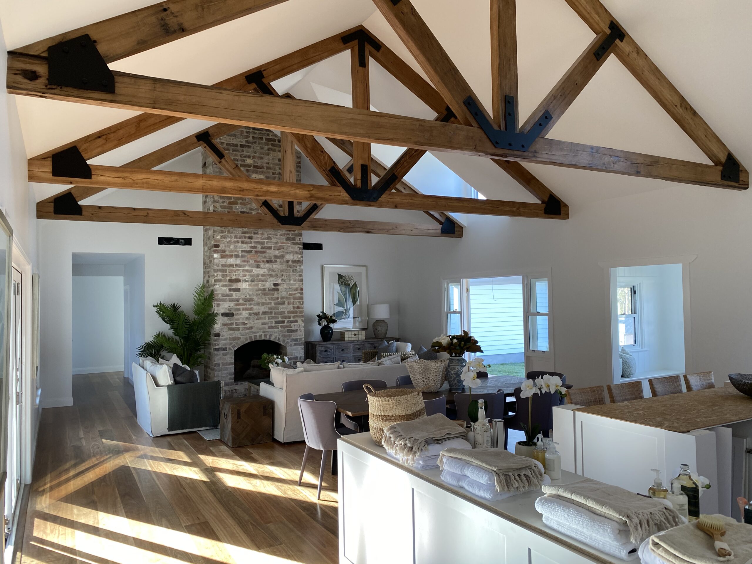
At first glance, brick and timber seem easy to work with — they’re natural, textured, and widely used across Australian homes. But what makes them beautiful also makes them tricky to match.
Both materials have strong undertones, and those undertones can shift depending on the light, age, and finish. When you place paint next to them without understanding what’s going on underneath, you risk creating subtle clashes that make everything feel off — even if you can’t quite explain why.
For example:
- Pairing cool grey walls with warm red-toned timber flooring can make the timber look orange.
- Using bright white next to rustic red brick can make the brick appear dirty or harsh.
- Trying to match tones too closely can lead to a muddy, washed-out feel.
The goal isn’t to match everything — it’s to balance the tones so they work together. That starts with understanding what’s going on in the materials themselves.
How to Identify the Undertones in Your Brick or Timber
Before you start choosing paint colours, it’s important to know what you’re working with. Both timber and brick have natural undertones — subtle colour casts that affect how everything around them looks.
Timber Undertones
Timber can be warm or cool, and that warmth comes from the species, age, and finish. Common undertones include:
- Yellow – seen in pine, ash, or some oaks
- Red/orange – common in jarrah, spotted gum, or cedar
- Brown – walnut and darker stains
- Grey – found in weathered or lime-washed timbers
A quick way to check: hold a pure white piece of paper next to the timber and see what colour it reflects. You’ll usually see the undertone more clearly this way.
Brick Undertones
Bricks also vary widely depending on the style and age of your home:
- Red/orange – traditional bricks with rich warmth
- Brown or terracotta – earthy, muted tones
- Grey or cream – common in more modern builds
- Speckled or mixed – blends that require more neutral balancing
Some bricks have variation within a single wall, which means you’ll need to choose a paint colour that works with the overall tone, not just a single brick.
Once you’ve identified whether your material leans warm or cool — and which type of warmth — you’ll be in a much stronger position to choose a complementary paint palette.
Paint Colour Families That Work Well with Brick
Brick is a strong visual element — especially on home exteriors — so the paint you pair with it needs to either soften the contrast or complement its warmth. Here’s what to consider based on the type of brick you’re working with:
Red or Orange Brick
Classic in many older and federation-style homes, these bricks have a warm, rich undertone that can look harsh if paired with the wrong paint.
- Best pairings: Warm neutrals, soft taupe, greige, warm whites (not bright white)
- Avoid: Cool greys and stark whites, which can make the brick look too orange or muddy
- Examples: Dulux White Duck, Wattyl Ashwood, Taubmans Cotton Ball
Brown or Terracotta Brick
More muted than red brick, these work well with a slightly broader range of colours.
- Best pairings: Earthy greens, olive, creamy off-whites, warm grey
- Avoid: Anything too cool or blue-based
- Examples: Dulux Hog Bristle, Resene Thorndon Cream
Grey or Cream Brick
Often found in modern homes, these give you a more neutral starting point.
- Best pairings: Soft whites, light greys, sage, warm black or charcoal for contrast
- Avoid: Colours that are too warm or yellow-based
- Examples: Dulux Tranquil Retreat, Taubmans Grey Matter
Mixed or Speckled Brick
In homes where bricks include a variety of tones, your safest bet is to keep the paint muted and simple.
- Best pairings: Mid-strength neutrals, warm whites, or a tone pulled from the dominant brick colour
- Avoid: Competing colours or anything too bold
Paint Colour Families That Pair Nicely with Timber
Timber brings natural warmth and texture to a space — but it also adds colour, whether you realise it or not. The paint you use nearby should either tone down the intensity or create soft contrast, depending on the look you’re going for.
Light, Yellow-Toned Timber (e.g. pine, ash)
- Best pairings: Warm whites, light greige, soft sage, pale mushroom
- Avoid: Stark white or blue-grey
- Examples: Dulux Natural White, Taubmans Snowy White
Red or Orange-Toned Timber (e.g. jarrah, cedar, spotted gum)
- Best pairings: Deep warm greys, taupe, muted green-grey, soft stone
- Avoid: Anything too red or yellow-toned
- Examples: Dulux Dieskau, Wattyl Feather Dawn
Brown or Dark-Stained Timber (e.g. walnut, dark oak)
- Best pairings: Warm white, dusty green, charcoal, clay-toned neutrals
- Avoid: Mid-browns or anything too close in depth
- Examples: Dulux Malay Grey, Taubmans Grey Comfort
Weathered or Grey-Washed Timber
- Best pairings: Light grey, pale greige, sage, cool whites
- Avoid: Yellow-based creams or overly warm whites
- Examples: Dulux Grey Pebble, Resene Quarter Tea
When to Use Contrast — and When to Blend
One of the biggest decisions when matching paint with brick or timber is whether you want your paint colour to contrast with the material — or blend into it.
Use contrast when:
- You want to highlight architectural features (like a timber ceiling against white walls).
- The brick or timber is visually heavy, and you want to lighten the space.
- You’re going for a more modern, defined look.
In this case, choose a colour that clearly separates itself in tone and depth — for example, crisp white walls with dark timber floors, or charcoal trims against red brick.
Use blending when:
- You want a softer, more cohesive look.
- The material already has strong texture or variation (e.g. reclaimed brick or exposed beams).
- You’re working with a heritage or country-style home.
Blending doesn’t mean matching exactly — it means choosing a tone in the same family. For instance, if you have warm mid-toned timber, try a muted beige or soft taupe on the walls. This creates harmony without making everything the same colour.
If you’re feeling stuck, consider the “60-30-10” rule:
- 60% dominant colour (usually your wall paint)
- 30% secondary colour (timber or brick feature)
- 10% accent colour (like trims or furnishings)
Final Tips Before You Paint
Test in the actual space
Paint samples can look very different in your home than they do on a swatch. Use sample pots and paint a large area next to your timber or brick — ideally on the same wall and under the same lighting.
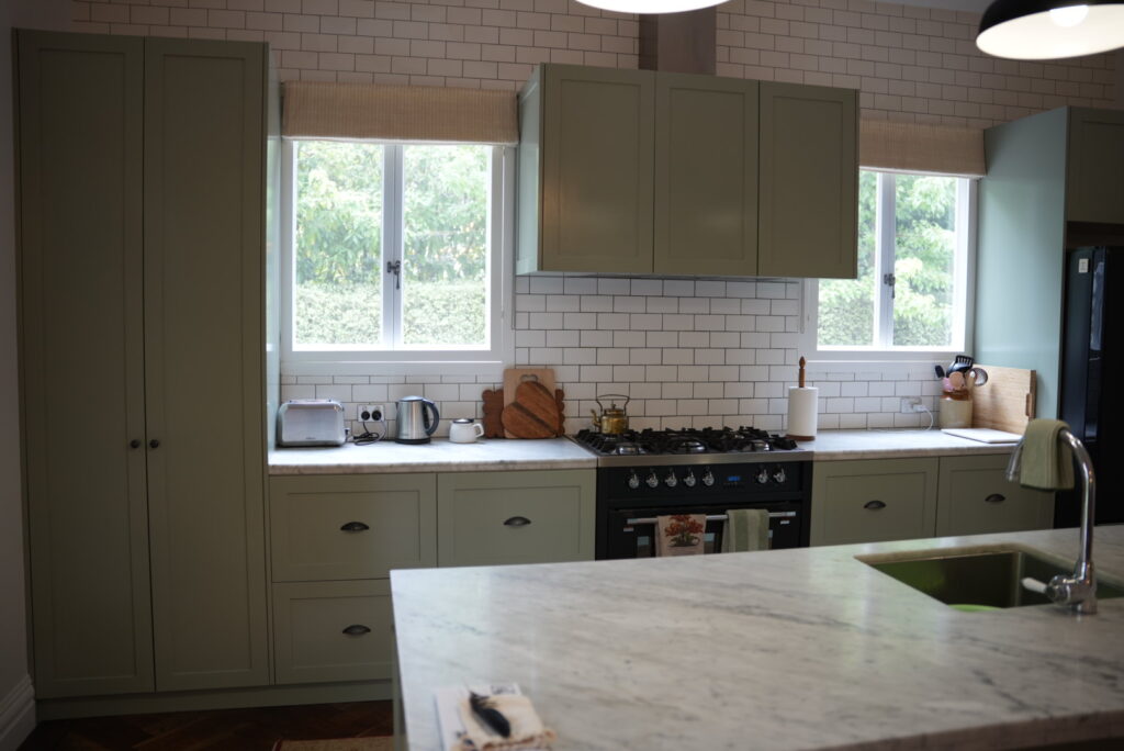
Consider all the fixed elements
Your flooring, kitchen cabinetry, benchtops, roof tiles, and window frames all play a part in how your paint will read. Make sure your chosen colour works with everything — not just the brick or timber.
Check it at different times of day
Morning light, afternoon sun, and artificial light all shift the appearance of paint. A colour that looks soft and creamy in the morning may appear yellow under warm lights at night.
Don’t try to match — complement instead
Trying to exactly match paint to timber or brick usually backfires. Aim for colours that sit comfortably beside your feature materials, not colours that compete or mimic.
Get input if you’re unsure
A second opinion from someone with a trained eye can help you avoid a costly mistake. Whether it’s a colour consultant or a professional painter, a fresh perspective is often all it takes to find the right fit.
Need Help Choosing a Colour Scheme That Works?
If you’re working with timber floors, exposed brick, or any other strong feature material — and you’re not sure which paint colours will bring it all together — we can help.
At Southern Highlands Painting & Wallpapering, we help homeowners select paint colours that balance texture, tone, and timeless appeal.
Whether you’re repainting a room or updating your home’s exterior, we’ll help you make confident colour choices that feel right — and last.
Contact us today to discuss your next project.