You want to add personality to your space — not paint yourself into a corner.
If you’ve ever fallen for a trendy feature wall, only to regret it a year later, you’re not alone. It’s easy to be drawn to the colour of the moment — terracotta, dusty blue, forest green — but harder to tell which ones will still look good down the track.
The problem with many accent colours is that they shout before you’ve thought through the room’s long game. And while paint can technically be changed, no one wants to repaint every 18 months because a bold choice didn’t go the distance.
At Southern Highlands Painting, we work with homeowners across the region who want their homes to feel fresh, modern — and still look good in five years. And that starts with choosing accent colours that age gracefully.
In this article, you’ll learn how to pick accent colours that won’t date, the biggest mistake most people make, and a handful of versatile colour ideas that work across different styles and spaces. You’ll walk away with a clearer sense of how to add personality without compromising timeless design.
Table of Contents
What Is an Accent Colour — and Why Use One?
An accent colour is a shade you use sparingly to create contrast, highlight features, or add visual interest to a space. Unlike your main wall or ceiling colour — which usually forms the neutral backdrop — an accent colour draws the eye. It’s the colour that says, “Look here.”
Accent colours are used to break up monotony, define a zone, or bring a bit of energy to an otherwise calm space. You’ll often see them on a single feature wall, around a fireplace, behind shelving, or on painted furniture or cabinetry. They’re also common in bedrooms, living rooms, entryways, and kids’ rooms — spaces where you want to inject a bit of personality.
Used well, accent colours can make a space feel bold, balanced, and custom. Used poorly, they can clash with your flooring, fight with your furnishings, or date your room.
That’s why the next step is so important — knowing what not to do.
The Biggest Mistake People Make with Accent Colours
Most accent colours go wrong not because they’re too bold — but because they’re too impulsive.
Choosing an accent colour based on a trending Instagram post, a paint chip in a hardware store, or what your friend used in their beach house is one of the quickest ways to end up with a colour that doesn’t work in your space. What looks stunning in a north-facing Sydney apartment might feel heavy and jarring in a Southern Highlands cottage with timber floors and filtered light.
The biggest mistake people make? They forget to look at the full context:
- The orientation and lighting in the room
- The undertones of their existing finishes (floors, tiles, cabinetry)
- How often they want to repaint when trends change
Instead of asking, “Does this colour look good right now?” ask, “Will I still like this in three years — and does it work with what I already have?”
That’s the mindset shift that leads to colours that last — and won’t make you cringe every time you walk past the hallway.
What Makes an Accent Colour Timeless? (+ Examples That Work)
Timeless accent colours aren’t necessarily boring — they’re just balanced. They work across multiple design styles, hold up as trends shift, and don’t overpower the room. The trick is to choose colours that are earthy, muted, or deep, rather than overly bright or novelty-based.
Here’s what to look for in a timeless accent:
It pairs well with neutrals
Your accent colour shouldn’t fight with your base walls, trims, or flooring. Think complementary, not competing.
It holds its own under different lighting
Some colours shift dramatically between day and night. Test your chosen shade in morning, afternoon, and artificial light to avoid surprises.
It doesn’t tie you to a specific trend
Very specific shades — like millennial pink or avocado green — can feel dated quickly. More classic tones age better.
It can shift between bold and subtle
Many timeless accents are flexible. Deep navy can feel dramatic or understated depending on where and how you use it.
Timeless Accent Colour Ideas for Aussie Homes
These shades have stood the test of time across homes in the Southern Highlands and beyond:
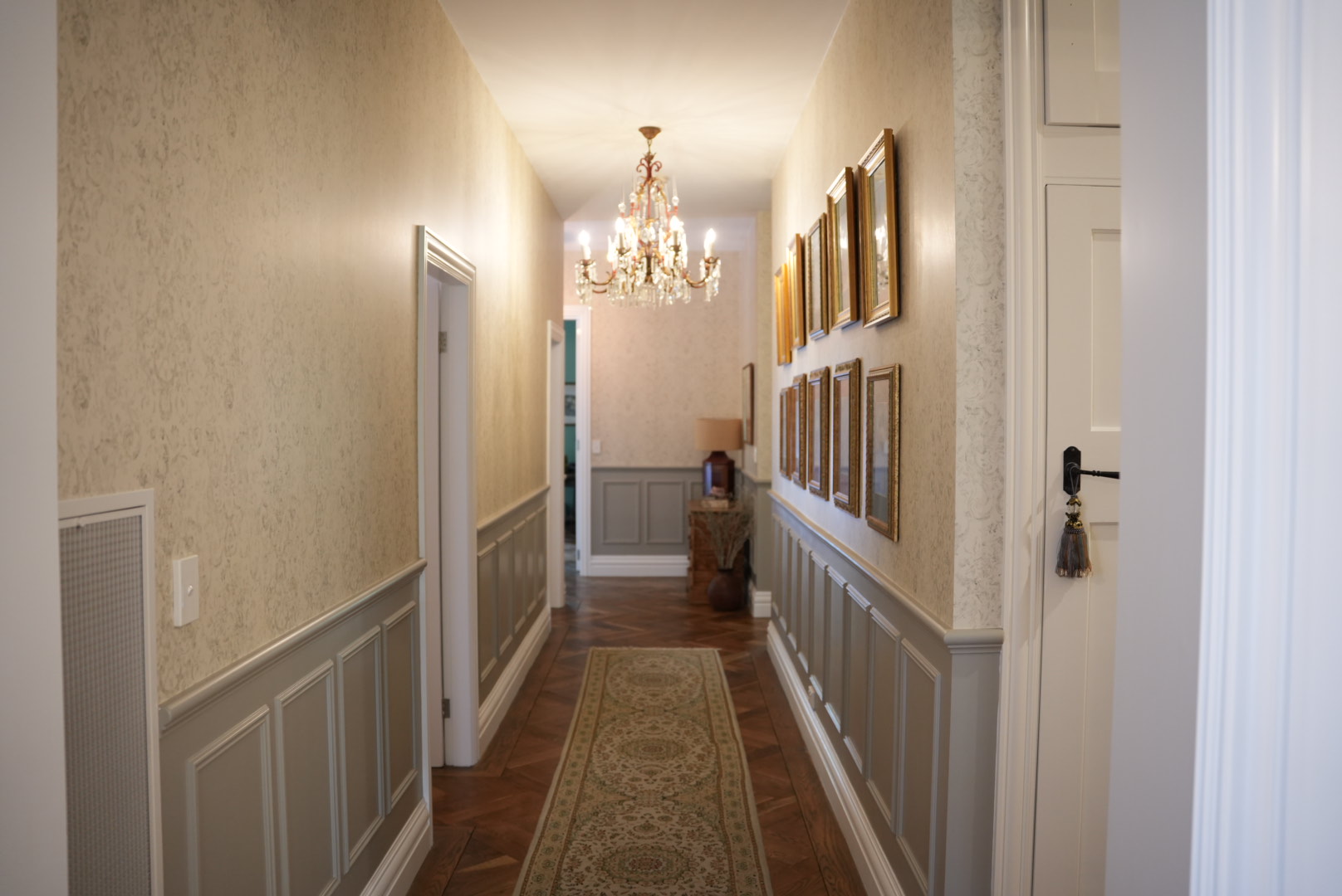
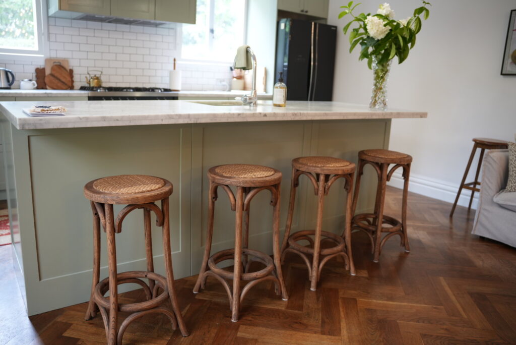
- Olive green: Warm, grounding, and works well with timber, brick and brass.
- Charcoal or deep grey: Adds depth without committing to black.
- Navy blue: A sophisticated alternative to black that works in most rooms.
- Terracotta or muted clay: Earthy and comforting — great with natural materials.
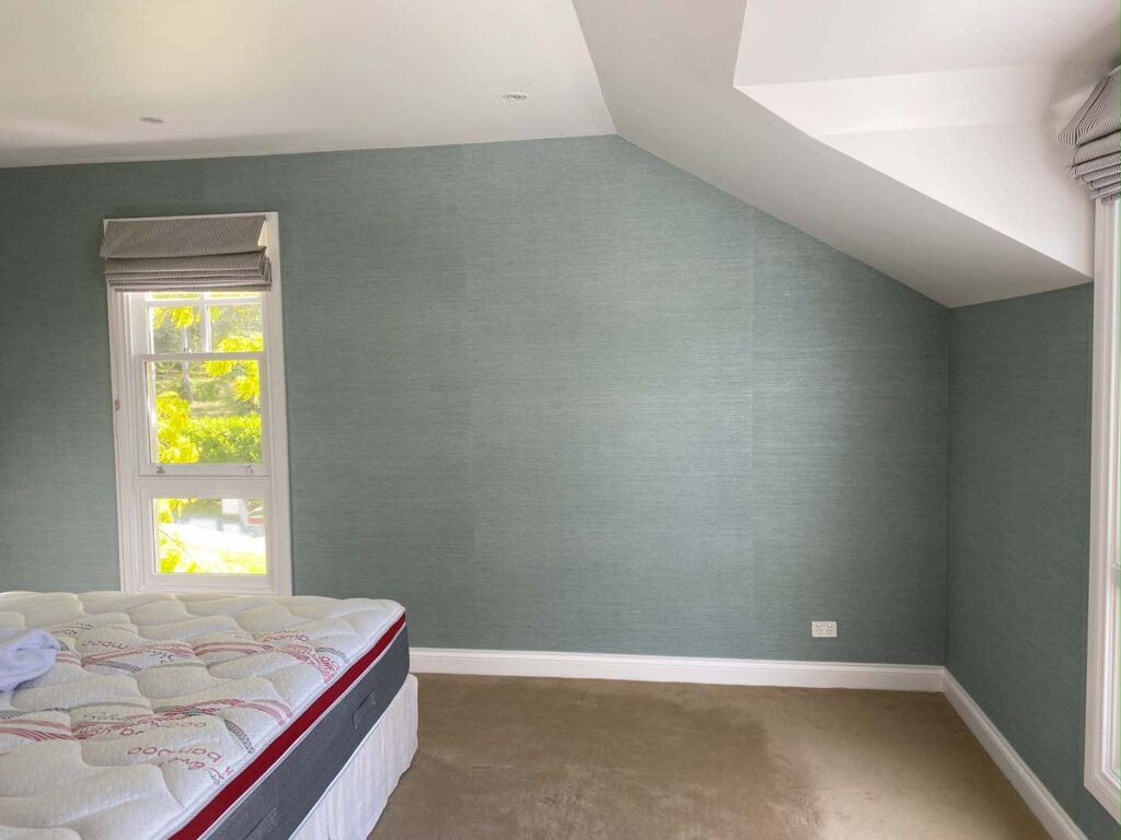
- Dusty blue: A soft, calming choice that doesn’t shout.
- Warm taupe: Subtle enough to blend, rich enough to stand on its own.
These tones bring character, contrast and calm — without dominating the space.
How to Pair Accent Colours with Neutrals and Features
An accent colour never lives on its own. For it to work well, it needs to sit comfortably alongside the other fixed elements in your room — like your walls, flooring, window frames, or furniture.
Here’s how to make sure your accent colour doesn’t stick out for the wrong reasons.
Start with what’s already in the room
Before falling in love with a paint swatch, look at your floors, benchtops, trims, or large furniture pieces. Do they have warm or cool undertones? Are they light or dark? Are there existing colours you’ll need to complement — or avoid?
For example:
- Timber flooring with yellow or red undertones pairs well with earthy colours like olive, clay, or muted mustard.
- Grey tiles or black frames suit cooler accents like navy, charcoal, or sage.
Match depth and intensity
If your base palette is soft and muted, a wildly bright accent will look jarring. Instead, match the intensity — for example, pair off-white walls with a dusty rose or sage green, rather than electric blue.
Keep the 60-30-10 rule in mind
This classic interior design guideline works for colour balance:
- 60% dominant colour (usually your walls or floors)
- 30% secondary colour (furniture or cabinetry)
- 10% accent colour (feature walls, soft furnishings)
Your accent should complement, not overpower, the other 90%.
Where to Use Accent Colours (Without Going Overboard)
Accent colours are meant to highlight — not take over. The trick is choosing where to place them so they create interest without overwhelming the space.
Feature walls
Still the most common use, but works best when it highlights an architectural detail — like a fireplace, built-in shelving, or an alcove. Avoid random accent walls with no purpose.
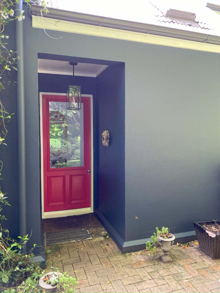
Doors and trims
Painting your front door, internal doors, or even window trims in a deep or moody tone can be just the right touch — especially if the rest of the room is neutral.
Built-in cabinetry
A rich colour on kitchen or laundry cabinets can act as an anchor for the room. Works especially well with warm whites or soft greys on the walls.
Furniture and décor
Accent colours don’t have to go on walls. A painted buffet, side table, or even a set of chairs in a coordinating colour can add the same punch without a long-term commitment.
Children’s rooms or creative zones
These are great places to have a bit more fun. Just be cautious with overly bright or primary tones — they can be stimulating in small doses but overwhelming in large ones.
A good rule: one major accent per room
If everything’s an accent, nothing is. Aim for one strong colour feature in each space — and let everything else support it.
Final Tips Before You Choose
Before you pick up the brush (or call your painter), here are a few quick tips to help make sure your accent colour holds up over time — visually and practically.
Test in real lighting — and at scale
Paint swatches look different depending on time of day, wall position, and surrounding colours. Use sample pots and paint a decent-sized patch on the actual wall, or better yet, a large board you can move around the room. Live with it for a few days.
Watch for colour drift from neighbouring surfaces
Accent colours can be shifted by the colours they sit next to. A neutral wall with a green undertone might make your soft grey accent look blue or muddy. Always view colours together, not in isolation.
Give yourself time to decide
If you’re feeling pressure to choose quickly — stop. Accent colours are the part of the palette you’re most likely to notice over time. Sit with the samples. Look at them morning, noon, and night. If a colour nags at you, it’s probably not the one.
Still unsure? Get professional advice
Sometimes it takes a trained eye to see what will actually work in your space — not just what looks good on a screen. A colour consultation or chat with a painter can save you weeks of second-guessing.

Need Help Choosing the Right Accent Colour?
If you’re planning to repaint your home or create a feature wall that actually works, we’d be happy to help. We’ve worked with homeowners across the Southern Highlands to choose colours that feel personal, modern — and won’t date by next season.
Contact the team at Southern Highlands Painting & Wallpapering to talk through your ideas, or get a quote for your next project.