You pick a paint colour you absolutely love — maybe it looked perfect in the shop, on the swatch, or in that Pinterest photo you saved months ago. But then the painters roll it onto your walls, and suddenly it looks… different. Too yellow. Too dark. Nothing like you expected.
You’re not going colour-blind. What’s happening is that lighting — both natural and artificial — changes the way paint actually appears on your walls. It’s one of the most common causes of colour regret in home painting, and it catches homeowners out all the time.
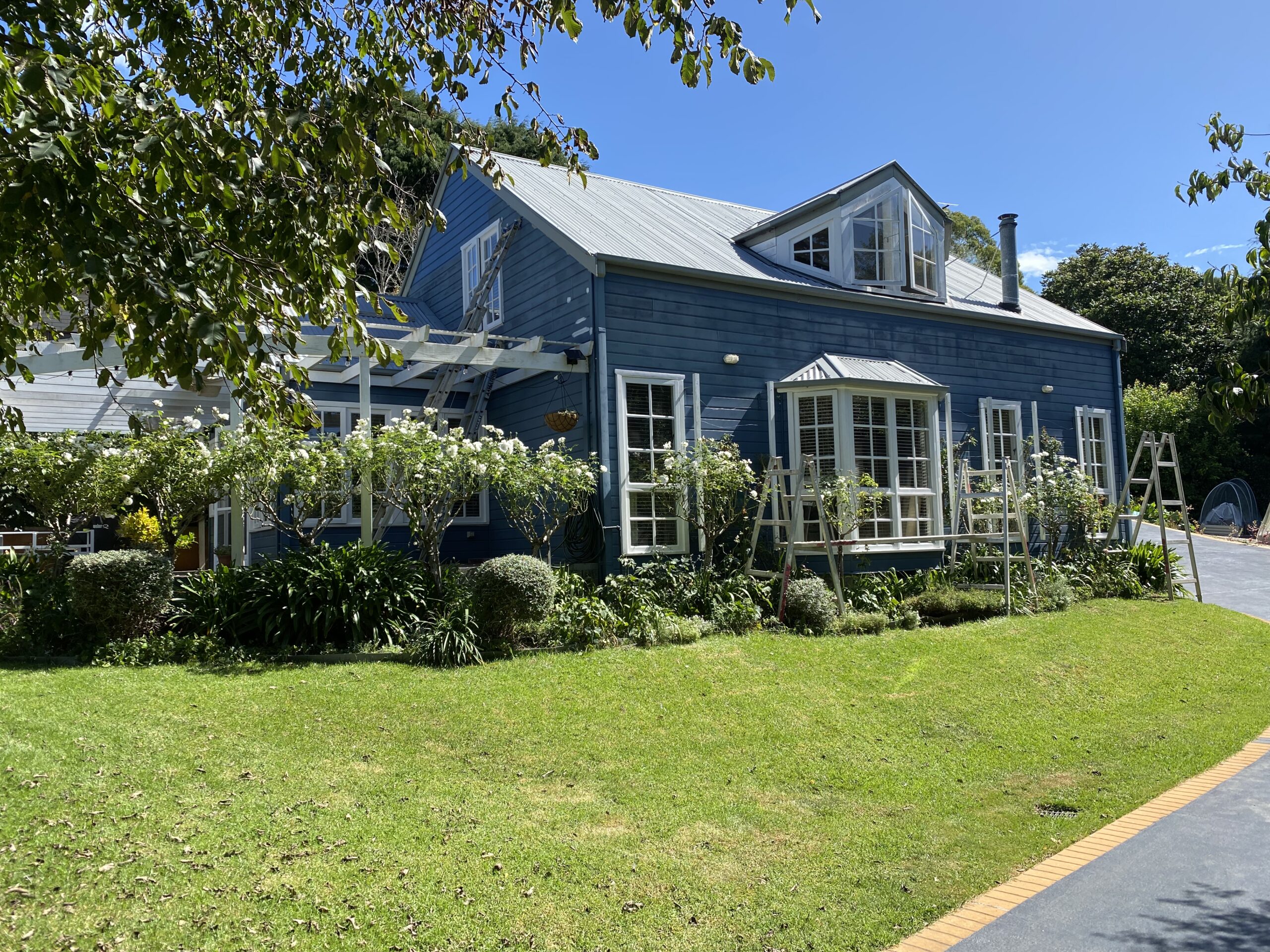
At Southern Highlands Painting & Wallpapering, we’ve seen this story play out in living rooms, bedrooms, and hallways across the region. The good news? It’s completely avoidable once you understand how lighting works.
In this blog, you’ll learn how different types of light affect paint colours, what to watch for when testing samples, and how to make smart colour choices that look great in your home, not just on a sample card.
Table of Contents
Why Does Lighting Change the Way Paint Looks?
Paint colour doesn’t live in a vacuum — it lives in light. The same shade of white, grey, or green can look completely different depending on the kind of light that’s hitting it. That’s because light affects how we perceive colour, not just what the colour “technically” is.
Here’s the simple version:
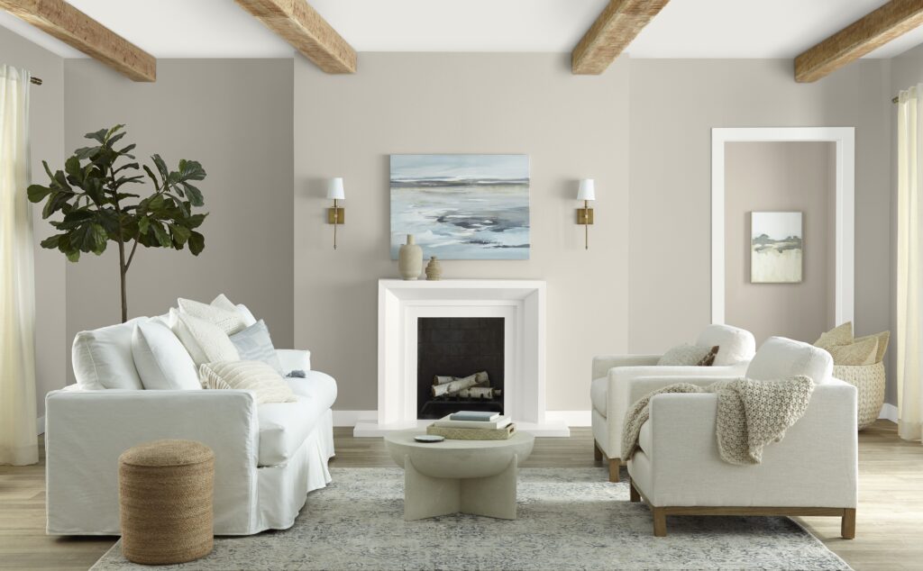
Light has colour too. Every light source — from the sun to your kitchen downlights — has a colour temperature, which can range from warm yellowish tones to cool bluish ones. When this light bounces off your painted walls, it blends with the paint colour and subtly shifts how your eyes register it.
That’s why a soft grey can suddenly look icy blue in one room, or why a warm beige might turn peachy-orange in another. It’s not the paint that changed — it’s the light.
This effect is even stronger when a room is mostly lit by artificial lighting, or if there’s not much natural daylight coming in. The walls take on the qualities of the dominant light source, especially at night.
If you’ve ever painted a wall and then wondered if the paint store gave you the wrong colour — it was probably the lighting.
Natural Light vs Artificial Light: What’s the Difference?
One of the biggest mistakes people make when choosing paint is testing colours under the wrong kind of light.
Natural light changes throughout the day and can dramatically shift how a colour looks depending on the time and the direction your room faces:
- North-facing rooms get cooler, indirect light all day. This can make colours appear more muted or even slightly blue or grey.
- East-facing rooms are flooded with warm morning light, but can feel cooler in the afternoon.
- West-facing rooms are the opposite — they might feel dull in the morning but glow with warm, orangey light in the late afternoon.
- South-facing rooms in Australia tend to get the brightest and most consistent natural light, often bringing out the truest version of your paint colour.
Then there’s artificial light, which is even more varied:
- Cool white or daylight bulbs (5000K–6500K) can make warm colours look stark or washed out. A soft cream might suddenly appear lemony.
- Warm white bulbs (2700K–3000K) tend to deepen reds, oranges, and yellows, but can muddy cooler tones like blue or grey.
- Halogens lean warmer, while LEDs can range widely depending on the brand and type.
The trick is, your walls don’t just exist at one time of day. What looks soft and airy in the afternoon sun might turn flat or dull under cool ceiling lights at night. That’s why it’s so important to test paint in your actual space, under your real lighting conditions.
Warm Light vs Cool Light: How It Changes Colour Temperature
Every light source has a “temperature,” measured in kelvins (K), which influences how warm or cool a colour appears. And yes — that one number on your light bulb can change everything about how your paint looks.
Here’s what to know:
- Warm lighting (2700K–3000K) gives off a soft, yellow glow. It’s cosy and inviting, but it can distort cool colours like blues, greens and some greys — making them look dull, muddy, or even slightly greenish. On the flip side, it intensifies warm colours like terracotta, beige, or blush — sometimes to the point where your “calm neutral” suddenly looks pink or peach.
- Cool lighting (5000K–6500K) gives off a bright, blue-white glow, closer to daylight. It sharpens whites and cool tones, but it can make warm hues feel harsh or washed out. Your creamy white might look cold. Your soft yellow might lean acidic.
This is why you can’t rely on the same paint looking great in two different homes — or even in two different rooms of your own home.
Quick example:
You might pick a neutral grey that looks perfect in your well-lit lounge. But in a hallway with warm LED downlights, it suddenly picks up an odd purple undertone.
Lighting doesn’t just affect how a colour looks. It affects which undertones are revealed — and that’s often what catches people out.
How to Test Paint Colours the Right Way (Before You Commit)
Testing paint properly is one of the easiest ways to avoid disappointment — and yet most people skip or rush this step. Don’t be one of them.
Here’s how to do it right:
Use Sample Pots — But Don’t Paint Directly on the Wall
It’s tempting to slap a few brushouts on the wall, but that can be misleading. The existing wall colour can influence how the sample appears, and you might not get a clean read.
Instead, paint two coats onto a large piece of white cardboard or an A4 sample board. This lets you move the sample around to see how it looks in different areas and at different times of day — without committing to a patchy wall.
Test at Different Times of Day
View your samples in morning light, afternoon sun, and under your regular nighttime lighting. You’ll often be shocked at how much the colour shifts across the day.
Look at Vertical AND Horizontal Angles
Hold the board upright against the wall, but also lay it flat. Ceilings reflect light differently than walls — and so do benchtops and floors. A colour that looks light and neutral upright may appear more saturated when seen at an angle.
Check It Against Your Room’s Elements
Your flooring, furniture, cabinetry and lighting all affect how a paint colour will read. Put your sample near these things, especially fixed items like timber trims, tiles, or benchtops, to see how the tones interact.
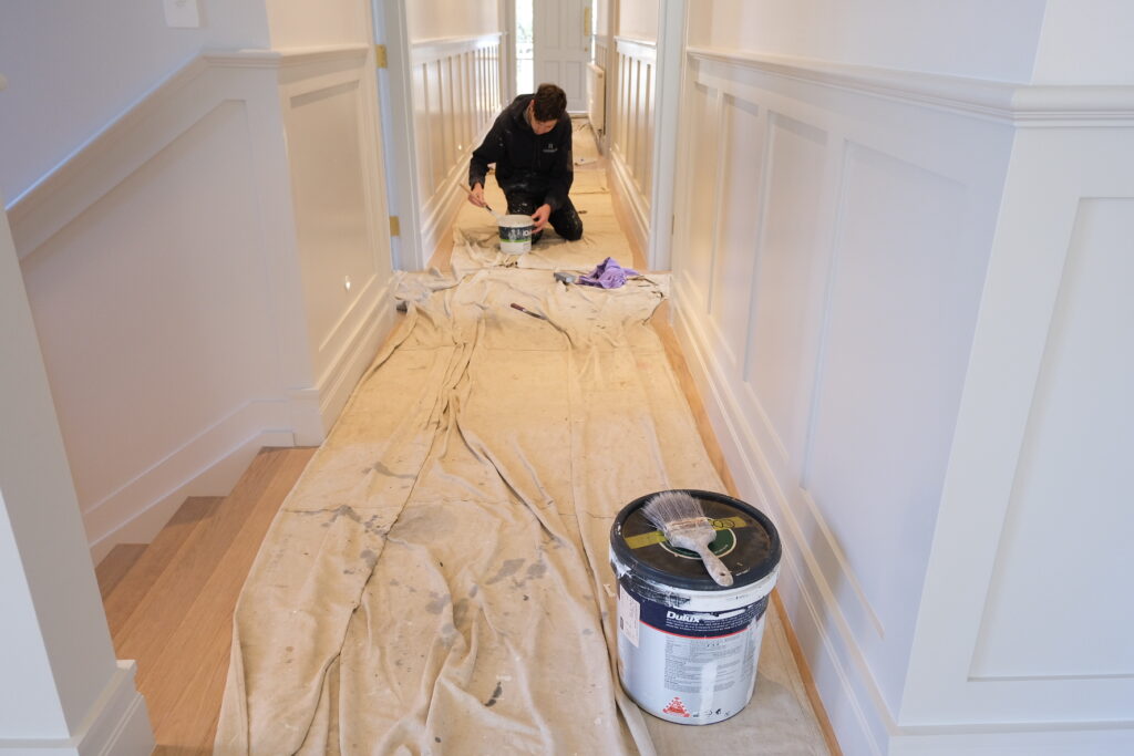
If this sounds like a lot — it is. But this kind of testing is exactly what professional painters do to make sure you’re happy before the first brushstroke. At Southern Highlands Painting, we help clients work through these decisions every day so that the colour looks right in your light, not just under showroom conditions.
Common Lighting Mistakes That Affect Paint Choice
Even with the best intentions, it’s easy to make simple lighting-related mistakes that throw off your paint colour. Here are some of the most common traps — and how to avoid them.
Mistake #1: Choosing Colour Based on the Paint Chart Alone
Paint charts are printed on small, glossy paper and viewed under store lighting — which is rarely the same as your home’s lighting. Relying on a swatch without testing in your actual space is one of the fastest ways to regret a colour choice.
Mistake #2: Forgetting How Light Changes Throughout the Day
You might love how a colour looks at 10am, but feel totally different about it at 6pm under artificial light. Not considering both natural and artificial light — and how they change — can skew your perception of a colour’s true character.
Mistake #3: Ignoring Fixed Elements in the Room
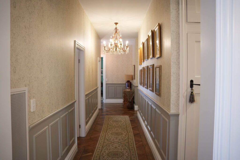
Your floorboards, tiles, countertops and even curtains cast reflections that alter how colours read. For example, red-toned timber can bring out pink or purple undertones in nearby wall colours.
Mistake #4: Painting a Room With Mixed Lighting Temperatures
Mixing warm and cool lights in the same space (e.g. a warm lamp and a cool LED ceiling light) creates visual tension and confusion. The paint may look inconsistent or clash with itself depending on where you’re standing.
Mistake #5: Not Asking for Help When You’re Unsure
Sometimes, it’s not about the colour being “wrong” — it’s about it being wrong for your space. That’s where a second opinion can save time, money, and sanity.
Professionals like Southern Highlands Painting bring practical, real-world experience to colour selection. We know how different paints react to different light — and we know what works in Southern Highlands homes.
Need a Second Opinion? When to Ask a Painting Pro
Sometimes you don’t need a different colour — you just need a different perspective.
If you’ve spent hours staring at swatches, second-guessing yourself, or wondering why nothing looks quite right on the wall, it might be time to bring in a professional.
Here’s what a local painting expert can help with:
- Identifying undertones that might not be obvious at first glance — but can show up strongly under certain lighting.
- Assessing your space — including light direction, room usage, and fixed design elements — to recommend colours that will perform well.
- Testing with the right tools — like large swatches, sample boards, and accurate lighting comparisons.
- Avoiding costly repaints — by making sure you get it right the first time.
At Southern Highlands Painting & Wallpapering, helping clients choose colours that work with their light — not against it — is a big part of what we do. We know the homes, the light conditions, and the common pitfalls that catch people out in our region.
You don’t have to figure it out alone. A quick consult can give you confidence in your colour choice and peace of mind that your paint will look just as good on your walls as it did in your head.
Trust What You See — In Your Light
Choosing a paint colour isn’t just about picking something that looks good in a photo or on a swatch. It’s about how that colour behaves in your home, with your lighting, and alongside everything else that makes your space yours.
Light changes everything — and understanding how it interacts with paint is one of the smartest things you can do before committing to a colour.
So here’s the takeaway:
- Don’t rush colour selection.
- Always test in your space, under your lighting.
- Pay attention to undertones, time of day, and surrounding surfaces.
- And if in doubt? Ask a pro.
At Southern Highlands Painting & Wallpapering, we’re here to help make sure your chosen colour looks just as beautiful on your walls as you imagined — no surprises, no do-overs, just paint that works with the light you live in.